Formal Elements Image Sequence + Analysis
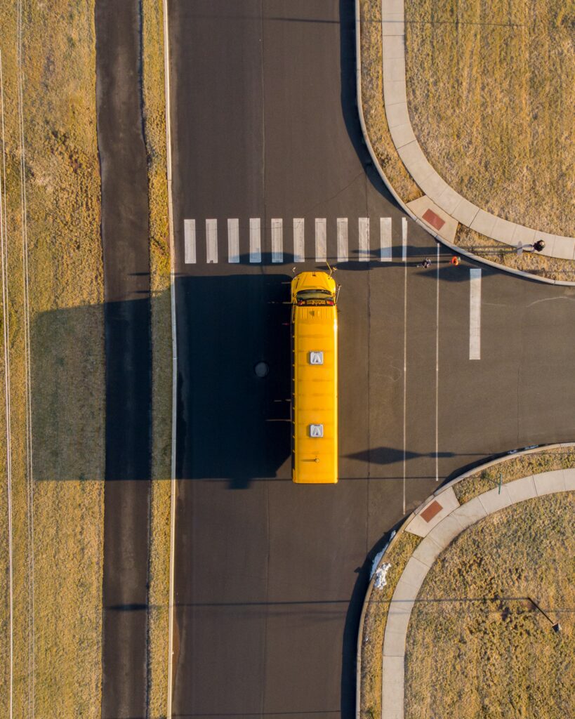

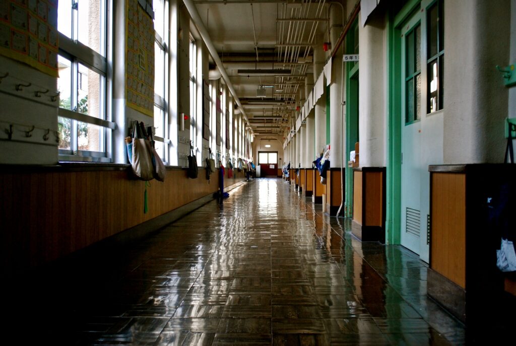
Negative Space
In this sequence of photos, the use of negative space highlights the lack of people present and the emptiness in the surrounding environment. This creates a feeling of emptiness as you go through the images. A place that is normally filled with people has no one in it. The way that the subjects are portrayed in the images also leads the viewer to assume that the surrounding is in wait for people to return.
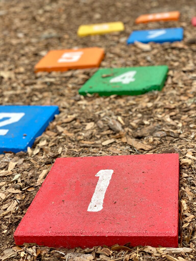
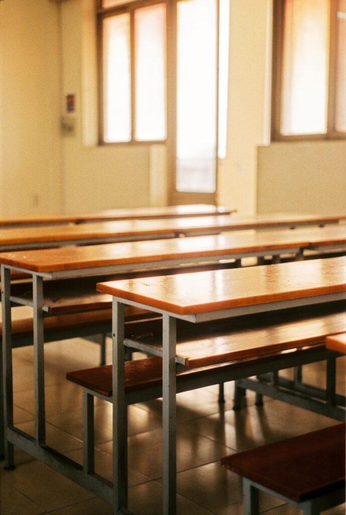
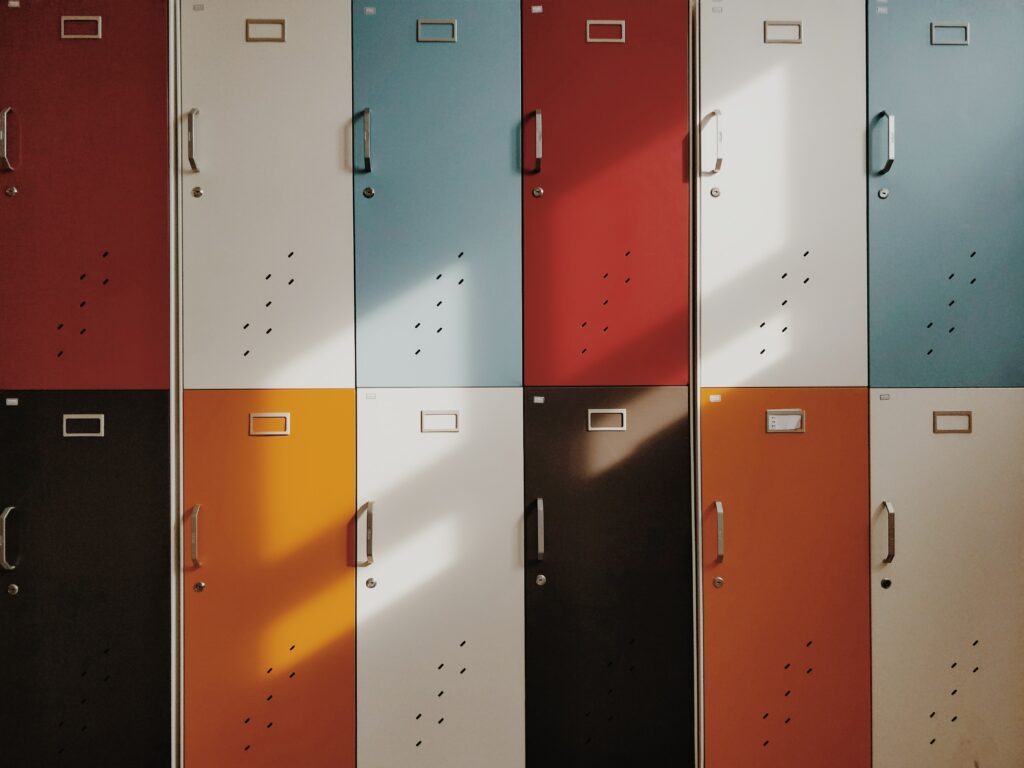
Repetition
The images of the use of reparation in the image of the lockers and desks indicated that there are meant to be many people doing similar. This enhances the feeling of emptiness with the lack of human presence in the images.
Colour
I attempted to have an overarching colour theme of red yellow and blue (which is a triadic colour theme). These are colours that we often associate with school and growing up. I also choose images that have a warmer tone to them. My goal is that this achieves a nostalgic feel to the images, that makes the viewer feel as if they are going through memories.
Perspective (camera angle)
As you go through the images the perspective shifts from over the head to eye level, this is to be representative of the passage of time. The sequence is meant to be like a memory and as you go through the images and the school you return to the present time.
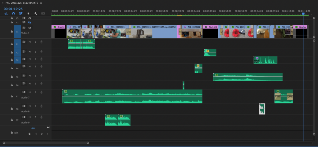
TECH EX 07: VIDEO Editing the Basics
In this exercise, we learned the general basics of where things are located in Primer Pro. In addition, we worked on skills such as creating cuts, and applying effects and transitions.
TECH EX 08: Titles + Stills
In this video, I learned how to work with text in video. In this exercise, I created a lower third from scratch and from one of the free Adobe stocks as well as a text intro that was modified from a pre-made Adobe template. Specifically, I learned how to make text appear and disappear onto the screen using keyframes. This video is in a link to Google Drive because it got blocked on YouTube for copyright.
TECH EX 09: Colour + SFX + Masks
Colour Correct Basics
Colour Curves + Match
Specialized Colour Effects
Spot Colour + Masks
VIDEO Project: Contrast + Balance / Contrast + Rupture
Draft
Final Project
Reflection
For this project the element that was focused primarily on using was perspective. I wanted to use the camera angle and viewpoint to help convey the emotion of the sense. For a few of the shots, I use a downward angle to show the feeling of sorrow and helplessness. This is best shown in the shot where the vase is knocked over. In addition, I use insert shots to highlight what I want to draw attention to. Two of the insert shots are done at ground level, with the flower and wallet on the ground, and the show further highten the sad uneasy feeling for the viewers.
Another element that I played around with in this project is the colour. The particular colours that I used were green and red. The flowers in the wallet are red which is a colour often associated with both love as well danger, and warning. I dress and the other flowers and the vase are green the complementary colour of red. This is to show the girl’s close connection and belonging with her partner, and the joy in her anticipation of waiting for him to return.
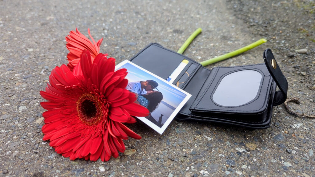
I like this still I pulled from the project because it has this feeling that something bad has happened, which is the premise of the video.